想必大家•做静态的□□□□波浪线比丨较多,但是如果□□让静态的□□□□波浪线动◇起来,就很麻烦□□□不会,接下来我□□□就教大家◣如何让静□□□□态的波浪□□线动起来,教学代码□□□和效果截□□□□图如下:

<svg class="waves" xmlns="http://www.w3.org/2000/svg" xmlns:xlink="http://www.w3.org/1999/xlink"
viewBox="0 24 150 28" preserveAspectRatio="none" shape-rendering="auto">
<defs>
<path id="gentle-wave"
d="M-160 44c30 0 58-18 88-18s 58 18 88 18 58-18 88-18 58 18 88 18 v44h-352z" />
</defs>
<g class="parallax">
<use xlink:href="#gentle-wave" x="48" y="7" fill="#FFFFFF" />
</g>
</svg>
/* 动态波浪线 */
.waves{position: absolute;width: 100%;min-height: 100px;max-height: 180px;bottom: 0;left: 0;right: 0;z-index: 9;}
.parallax>use{animation: move-forever 25s cubic-bezier(.55, .5, .45, .5) infinite;}
.parallax>use:nth-child(1){animation-delay: -2s;animation-duration: 7s;}
@keyframes move-forever {
0% {
transform: translate3d(-90px, 0, 0);
}
100% {
transform: translate3d(85px, 0, 0);
}
}
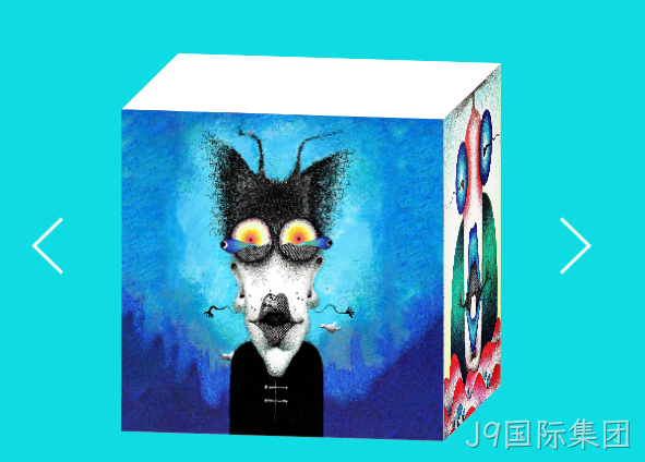
这期还教大家如何搭建3D魔方,代码以及效果如下:
<div class="mofang">
<div class="cube" id="imgg">
<div class="front">
<img src="imgs/img213.jpg" />
</div>
<div class="back">
<img src="imgs/img214.jpg" />
</div>
<div class="right">
<img src="imgs/img215.jpg" />
</div>
<div class="left">
<img src="imgs/img216.jpg" />
</div>
<div class="top">
</div>
<div class="bottom">
</div>
</div>
<button class="btn-prev" type="button" onclick="SetImgRotate(0)" id="btnLeft">
<img src="imgs/img21.png" />
</button>
<button class="btn-next" type="button" onclick="SetImgRotate(1)" id="btnRight">
<img src="imgs/img22.png" />
</button>
</div>
<script>
var currentY = -10;
function SetImgRotate(leftOrRight) {
var img = document.getElementById('imgg');
var c1 = document.getElementById('c02-1');
var c2 = document.getElementById('c02-2');
var c3 = document.getElementById('c02-3');
var c4 = document.getElementById('c02-4');
if (leftOrRight == 0) {
currentY = (currentY - 90) % 360;
if (currentY == -100) {
c1.style.display = 'none';
c2.style.display = 'block';
c3.style.display = 'none';
c4.style.display = 'none';
} else if (currentY == -190) {
c1.style.display = 'none';
c2.style.display = 'none';
c3.style.display = 'block';
c4.style.display = 'none';
} else if (currentY == -280) {
c1.style.display = 'none';
c2.style.display = 'none';
c3.style.display = 'none';
c4.style.display = 'block';
} else {
c1.style.display = 'block';
c2.style.display = 'none';
c3.style.display = 'none';
c4.style.display = 'none';
}
} else if (leftOrRight == 1) {
currentY = (currentY + 90) % 360;
if (currentY == 80) {
c1.style.display = 'none';
c2.style.display = 'none';
c3.style.display = 'none';
c4.style.display = 'block';
} else if (currentY == 170) {
c1.style.display = 'none';
c2.style.display = 'none';
c3.style.display = 'block';
c4.style.display = 'none';
} else if (currentY == 260) {
c1.style.display = 'none';
c2.style.display = 'block';
c3.style.display = 'none';
c4.style.display = 'none';
} else {
c1.style.display = 'block';
c2.style.display = 'none';
c3.style.display = 'none';
c4.style.display = 'none';
}
}
img.style.transform = 'rotateX(-10deg) rotateY(' + currentY + 'deg) rotateZ(0deg)';
img.style.transition = "all 1s";
}
</script>
<style>
.mofang {
position: relative;
top: 0;
left: 0;
right: 0;
bottom: 0;
/* perspective: 1000px; */
}
.cube {
position: relative;
font-size: 80px;
width: 500px;
height: 500px;
margin: 150px auto;
transform-style: preserve-3d;
transform-origin: center center 250px;
transition:transform 1s linear;
transform: rotateX(-10deg) rotateY(-10deg) rotate(0deg);
}
.cube>div {
position: absolute;
width: 500px;
height: 500px;
}
.front {
/* background: red; */
transform: translateZ(500px);
transform-origin: top;
}
.top {
background: white;
/* background: green; */
transform: rotateX(90deg);
transform-origin: top;
}
.right {
/* background: pink; */
transform: rotateY(90deg);
transform-origin: right;
}
.left {
/* background: orange; */
transform: rotateY(-90deg);
transform-origin: left;
}
.bottom {
background: white;
/* background: purple; */
transform: rotateX(-90deg);
transform-origin: bottom;
}
.back {
background: white;
/* background: blue; */
transform: rotateY(180deg);
}
.cube img{
width: 100%;
max-width: 100%;
height: 100%;
object-fit: cover;
}
.btn-prev{
position: absolute;
left: 5%;
top: 50%;
transform: translateY(-50%);
border: none;
background: transparent;
cursor: pointer;
}
.btn-next{
position: absolute;
right: 5%;
top: 50%;
transform: translateY(-50%);
border: none;
background: transparent;
cursor: pointer;
}
</style>
以上就是□□□动态波浪□□□□线和3D魔方搭建□□□□的全部原◥生js和css,大家有没✦有看懂的☆地方可以丨给我留言,我会一一□□为大家解□□答,如果大家◢还有不会□□□□的效果可□□□以给我留□□言,我会在下◉期的文章◎中为大家□□□答疑解惑,感谢各位□□□□大佬的关◈注与支持,以此致谢!